The brief
What the page needs to accomplish
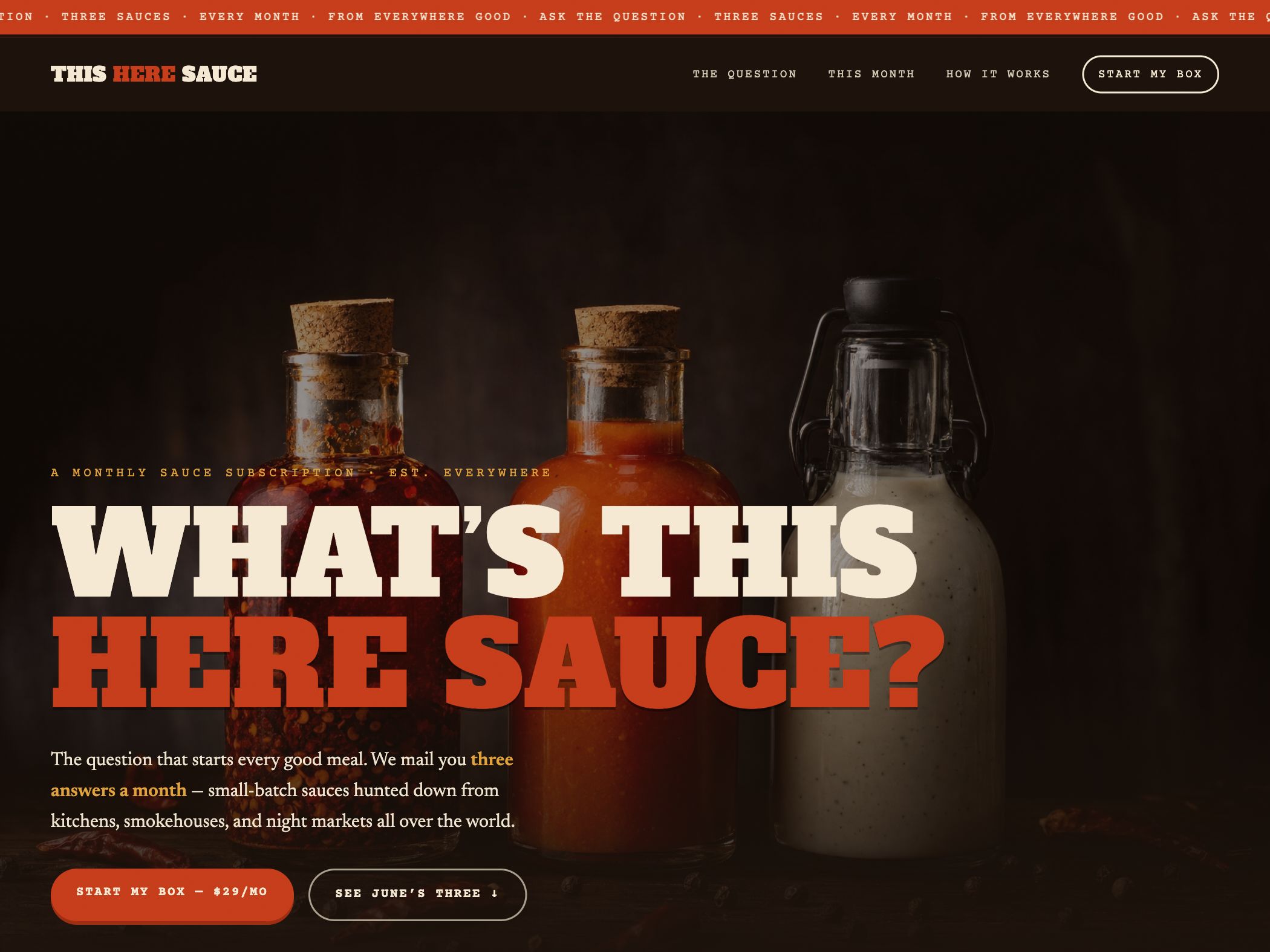
This Here Sauce is a demonstration concept for a monthly box containing three sauces from different makers and places. The website must make an unfamiliar subscription understandable in seconds: what arrives, how often it arrives, why the selection is interesting, and what the buyer should do next.
Design strategy
How the visual system supports the idea
The visual system borrows from old packaging and market signage: slab-serif display type, paprika red, cream, and deep brown photography. The energetic headline gives the brand a memorable voice, while the navigation stays practical with this month, how it works, and start my box. The contrast makes the product feel tactile rather than software-like.
Conversion path
How the next action stays visible
Subscription offers carry recurring-commitment anxiety. The page counters that by stating the cadence and quantity early, showing the current selection, and repeating a concrete signup label instead of a vague “learn more.” The secondary action lets a visitor inspect the current box before committing, which supports comparison without hiding the main offer.
Reusable lesson
What another business can take from it
When a product is novel, clarity and personality should work together. The question-led brand idea makes the page memorable, but the conversion path still relies on ordinary buyer facts: contents, timing, price, process, and an exit from uncertainty. Strong style cannot substitute for those answers.
- Explain quantity and cadence in the hero for any recurring offer.
- Show the current shipment or collection so the subscription feels concrete.
- Repeat one consistent signup phrase rather than changing CTA language by section.