The brief
What the page needs to accomplish
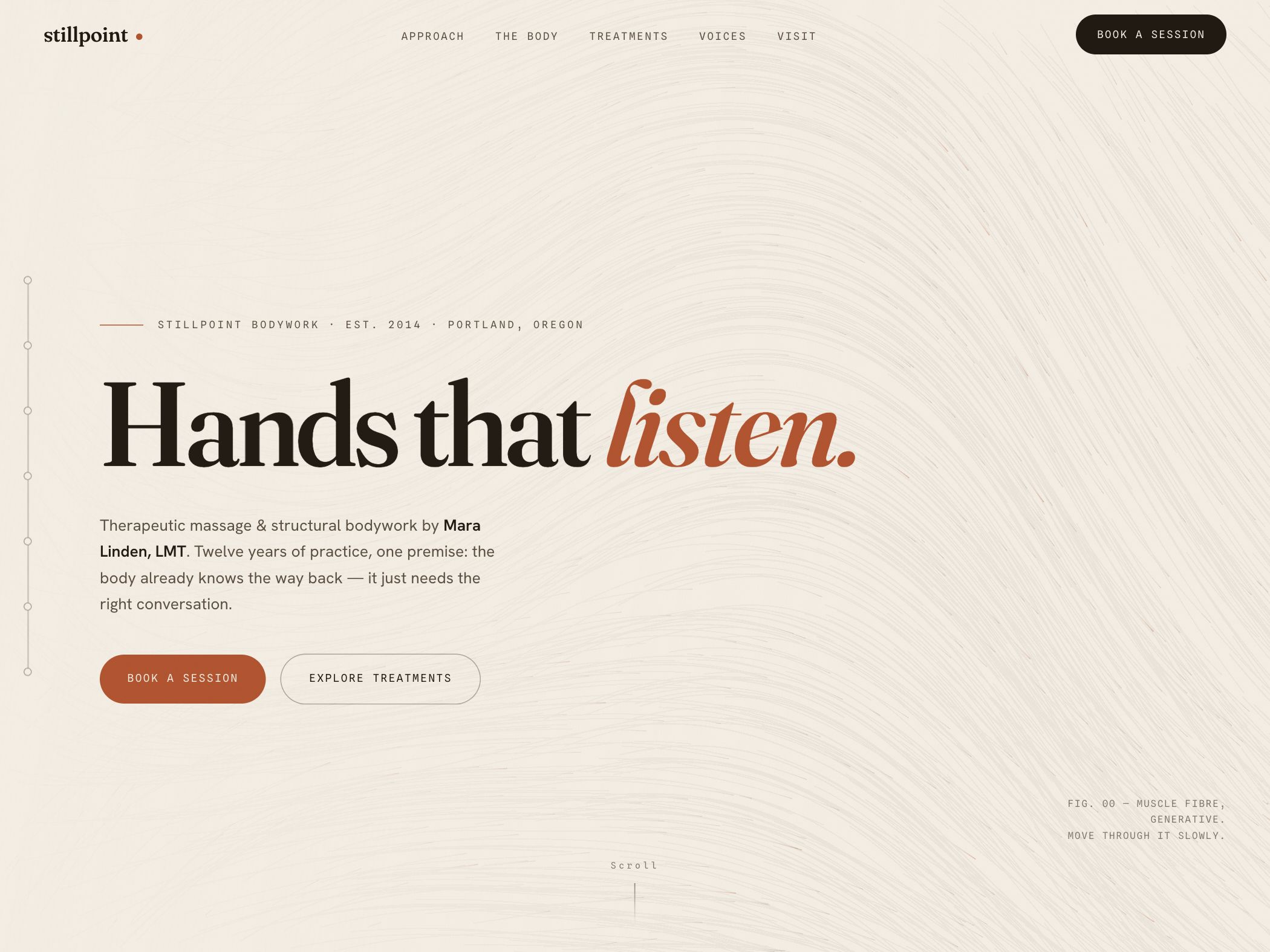
Stillpoint Bodywork is a demonstration concept for a Portland therapeutic massage and structural bodywork practice. The website needs to create emotional safety while still answering practical questions about the practitioner, approach, treatments, location, and how to book.
Design strategy
How the visual system supports the idea
The page uses an off-white field, subtle line texture, dark brown type, and a restrained clay accent. Large serif typography provides warmth, while the small technical labels suggest care and structure. Generous space slows the pace without removing information. The result is quiet, but the booking control remains visually solid and easy to find.
Conversion path
How the next action stays visible
Wellness visitors often want to understand fit before scheduling. The hero therefore pairs “book a session” with “explore treatments,” and the navigation exposes approach, practitioner context, treatments, voices, and visit information. The structure does not demand immediate commitment; it gives visitors a direct route to whichever trust question is holding them back.
Reusable lesson
What another business can take from it
A calm brand does not require passive calls to action or abstract copy. Stillpoint keeps its emotional tone while naming therapeutic massage, structural bodywork, the practitioner, the city, and the booking step. That combination is more useful than wellness language that sounds soothing but never explains the service.
- Name the modality, practitioner, and location near the primary promise.
- Let hesitant visitors explore treatments without obscuring the booking action.
- Use space and texture for tone while keeping navigation labels concrete.