The brief
What the page needs to accomplish
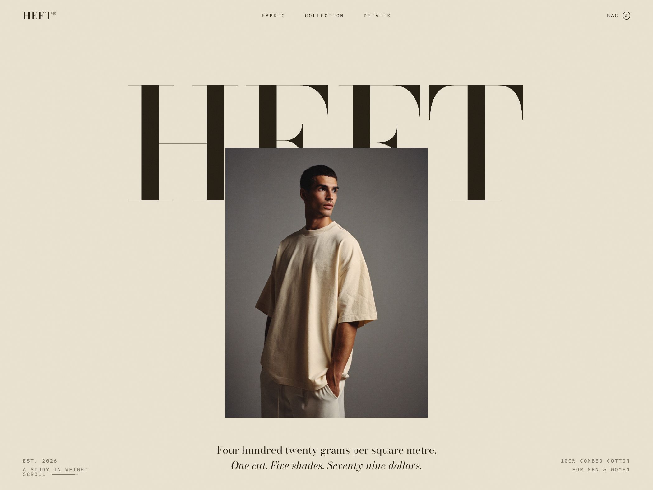
HEFT is a demonstration concept for a heavyweight 420 GSM T-shirt offered in one cut and a small color range. The site’s job is not to present a huge catalog. It must turn material weight, construction, silhouette, and finish into reasons to care about a deliberately narrow product.
Design strategy
How the visual system supports the idea
The visual approach treats the shirt like an editorial object: warm neutral space, monumental typography, centered fashion photography, and small specification labels. The composition communicates weight and restraint without filling the hero with feature badges. Navigation mirrors the buying questions—fabric, collection, details, and bag—rather than inventing broad lifestyle categories.
Conversion path
How the next action stays visible
A single-product store benefits from progressive disclosure. The hero establishes the object and core specification, then the visitor can move into fabric, cut, shades, and construction. Price and product facts are presented as part of the proposition, not hidden until checkout. The bag remains visible without competing with the product story.
Reusable lesson
What another business can take from it
Narrow inventory can be positioned as conviction rather than limitation. A focused page should explain why the product exists, what makes its material or construction different, and how the available choices work. The design earns its minimalism by giving every remaining detail a clear role.
- Turn technical product specifications into part of the main value proposition.
- Match navigation to buying questions instead of generic brand sections.
- Use a limited catalog to simplify the path from interest to product detail.