The brief
What the page needs to accomplish
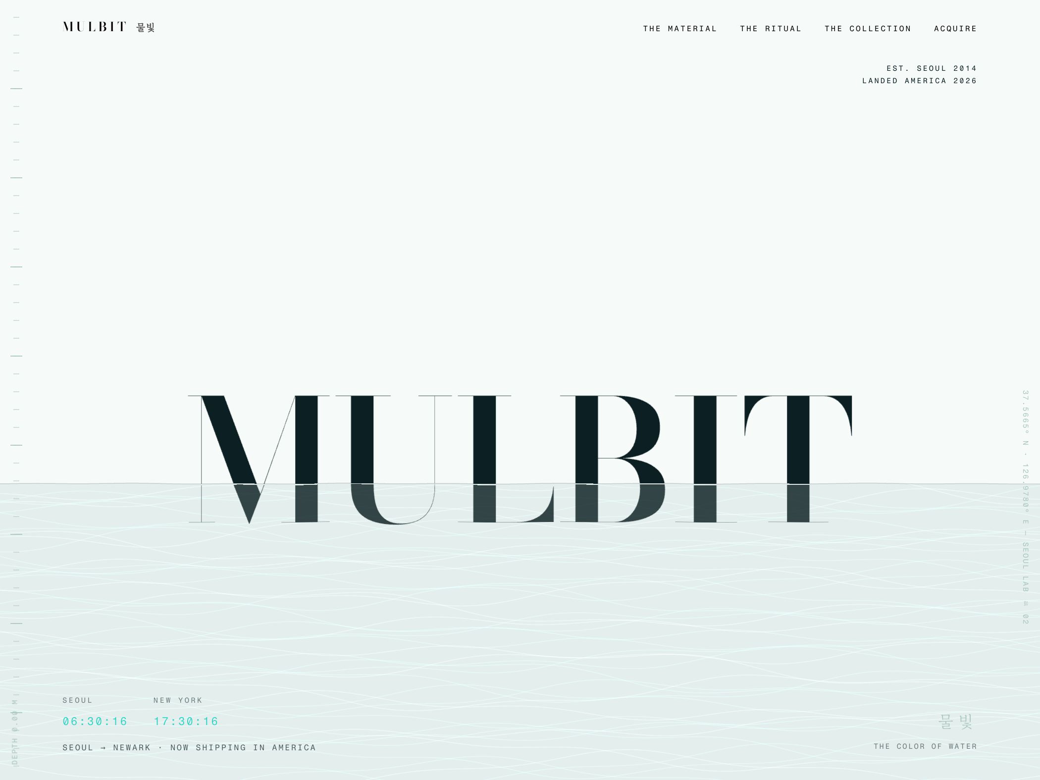
MULBIT is a demonstration concept for a Seoul skincare line introduced to an American audience. The page has to connect an unfamiliar name and point of view to an understandable product journey without flattening the brand into generic beauty language.
Design strategy
How the visual system supports the idea
The art direction uses pale mineral color, waterline graphics, precise coordinates, bilingual naming, and large high-contrast typography. Those devices establish place and material before the product collection appears. The navigation—material, ritual, collection, acquire—gives the visual world a disciplined commercial structure.
Conversion path
How the next action stays visible
For a new beauty concept, buyers need both narrative and sequence. The page introduces the origin, explains what the material story means, then organizes products as a ritual rather than a disconnected grid. “Acquire” is a deliberate brand-voice choice, but it remains paired with collection navigation so visitors can still locate the commercial path.
Reusable lesson
What another business can take from it
Distinctive cultural or material inspiration needs careful structure. The strongest version does not rely on mood alone; it translates the concept into product order, usage, naming, and navigation. A brand can feel unfamiliar and still make the next step legible.
- Introduce an unfamiliar brand name with a clear origin and category context.
- Translate story into product sequence so narrative supports shopping.
- Keep experimental language anchored by recognizable collection navigation.