The brief
What the page needs to accomplish
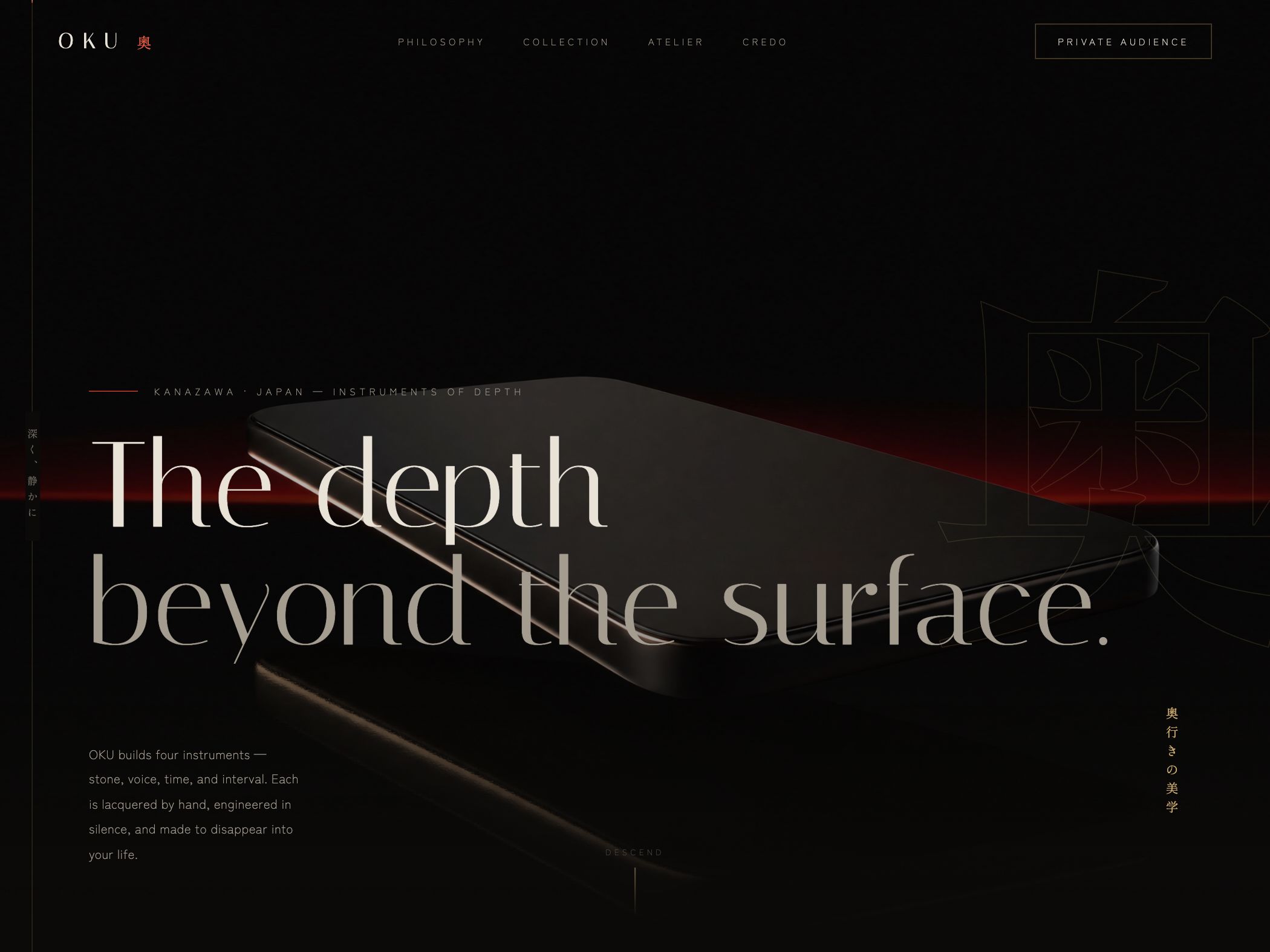
OKU is a demonstration concept for a small collection of handcrafted technology objects. The page explores how a premium, invitation-led product can communicate philosophy and material discipline before revealing a conventional feature list.
Design strategy
How the visual system supports the idea
The site uses black space, a thin red horizon, quiet navigation, Japanese typographic details, and a single dark product form. Oversized editorial copy creates the primary composition. The approach is intentionally cinematic, while the navigation—philosophy, collection, atelier, credo—provides a stable map through the brand argument.
Conversion path
How the next action stays visible
This is an invitation model rather than a broad retail funnel. “Private audience” signals the access pattern in the navigation, while collection and atelier content give visitors reasons to continue. That restraint only works because the intended action is specific. A luxury site with no identifiable access path would merely be mysterious.
Reusable lesson
What another business can take from it
Minimal product disclosure can create curiosity, but it must match the commercial model. An invitation-led concept can delay specifications longer than a mass-market device page. The essential discipline is to make the access mechanism and the category context clear enough that atmosphere does not become confusion.
- Match the amount of product disclosure to the actual sales model.
- Use a specific invitation or access action when checkout is not the next step.
- Give cinematic pages a stable navigation map so visual restraint remains usable.